Johnston Carmichael
Accountancy
Edinburgh
Brand look and feel (refresh)
Brief
Chartered accountants Johnston Carmichael asked us to refresh their long-standing visual brand. While they wanted their logo, brand colours and typefaces to stay the same, they needed a new creative approach to applying the brand.
We were tasked with evolving the existing brand look and feel, helping it to stand out in a crowded marketplace and positioning it as a progressive company with good people at its core.
Our approach
We got to know the brand and learned about its practical application. This gave us a clearer picture of our brief, as well as how the brand should function for the internal team.
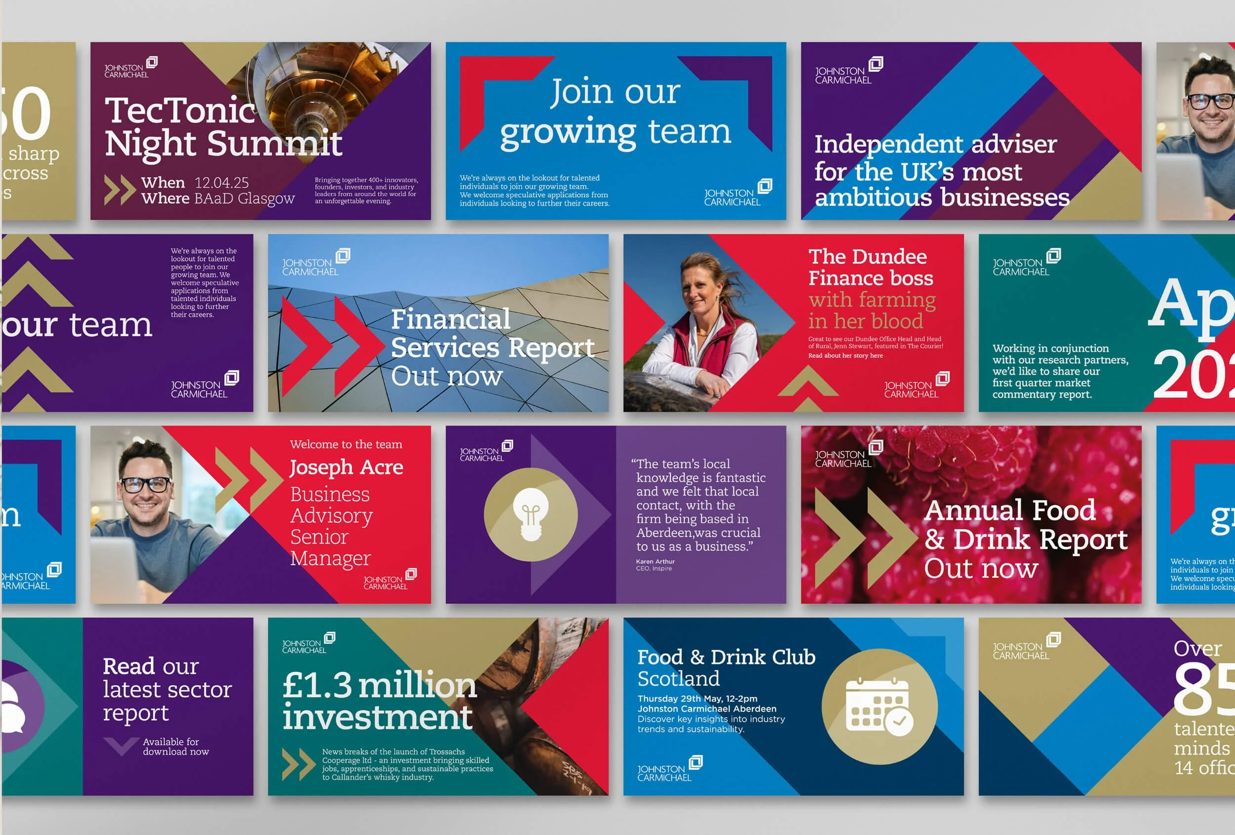
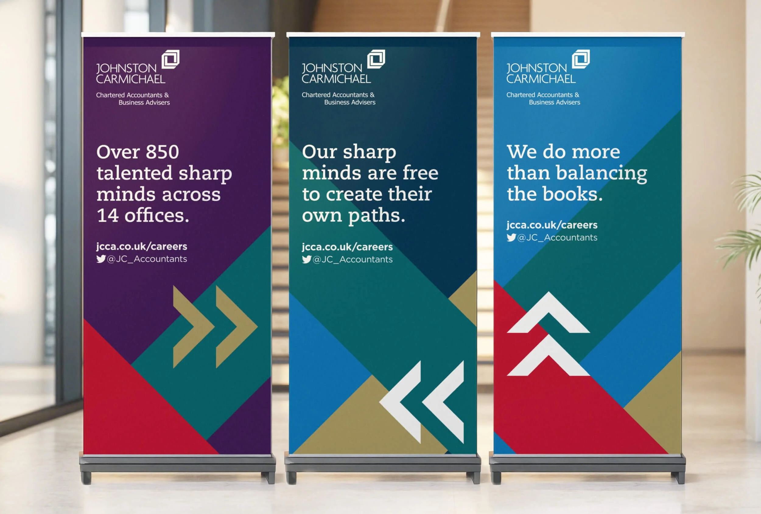
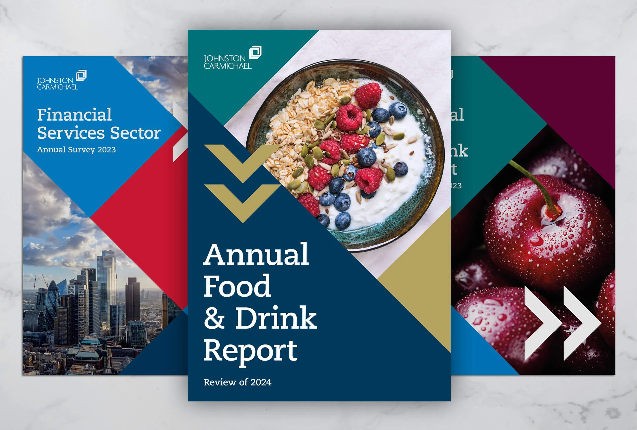
We wanted to convey the business’ sense of confidence and warmth, so we introduced larger typography and sharper infographics, and paired them with approachable imagery of the Johnston Carmichael team. We amplified the existing chevron graphics, making them an integral element of its visual language.
To allow the internal team to easily implement the refreshed branding across all of its communications, we developed guidelines, graphic templates and a suite of assets.
“Sophie at Flock has been transformational in our brand refresh. We liked our brand and what it stood for, but felt that it needed a fresh image. Being a UK-wide professional services firm in a competitive market we needed a brand identity that not only represents who we are as a firm today, and in the future, but stands out in the noise and most importantly reflects our personality. Sophie took time to fully understand our needs, ambitions and values, and the result is a really powerful, distinctive and flexible identity. Not only is Sophie highly creative, she’s a joy to work with and quickly became an extension to our Marketing team, and as a result, our trusted adviser.”