Inclusive Surfing Scotland
Charitable organisation
Edinburgh
Brand look and feel
Brief
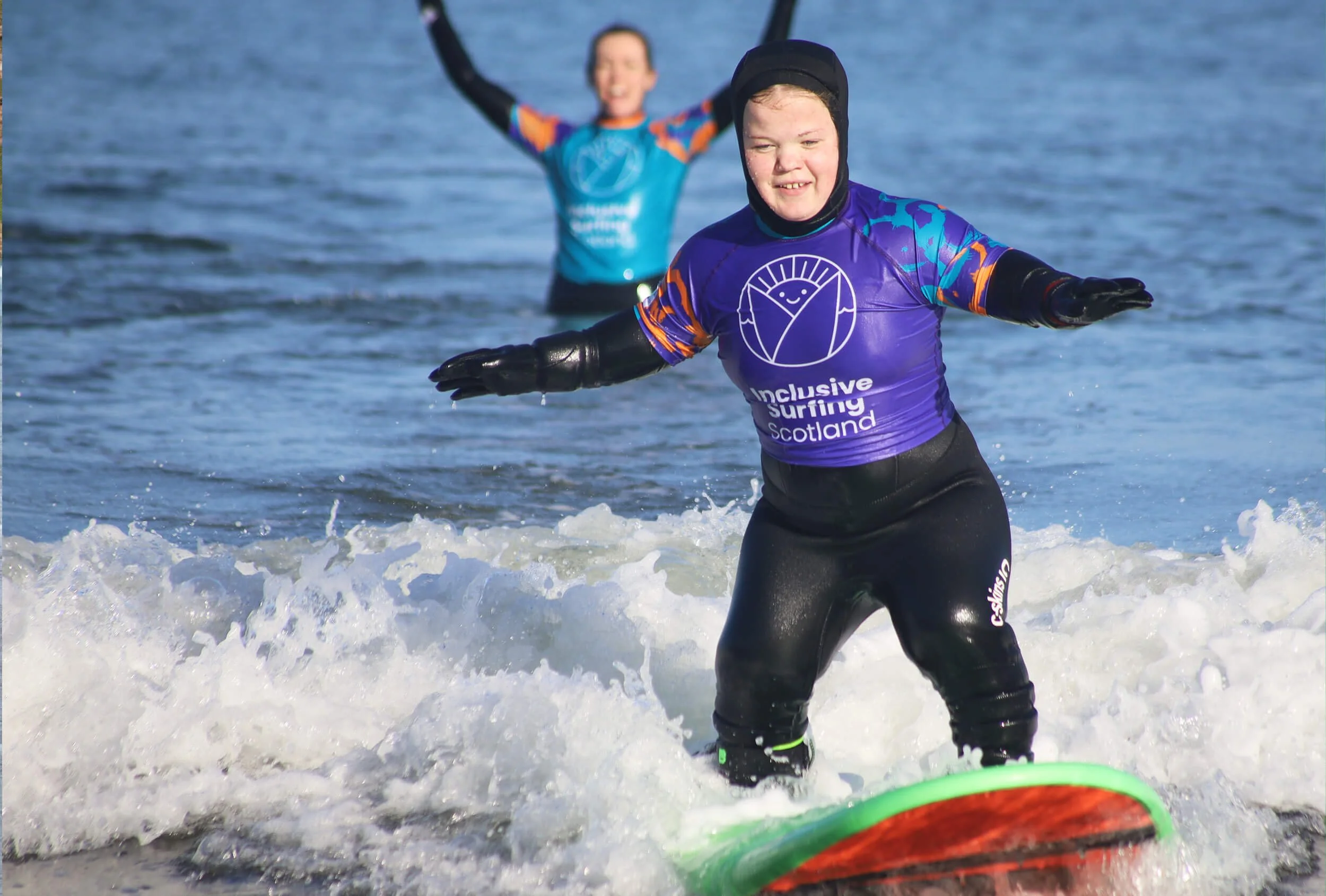
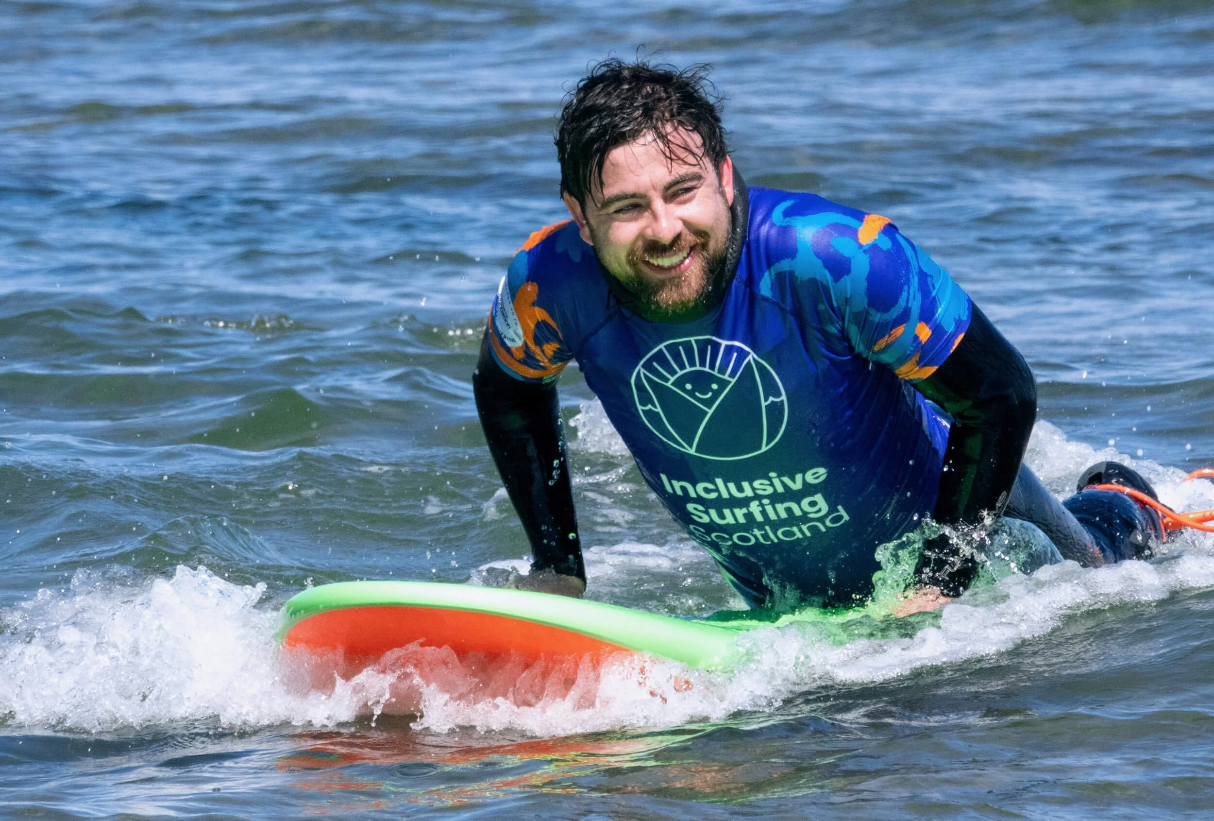
New charity Inclusive Surfing Scotland thinks everyone should have the chance to shred some gnarly waves, brah. The organisation aims to encourage people of all ages and abilities to get into surfing, including people with ASD, visual impairments and wheelchair users.
The ISS team asked Flock to build a fun, memorable brand that was both appealing and accessible. Read on to find out why they thought our work was totally tubular.
Our approach
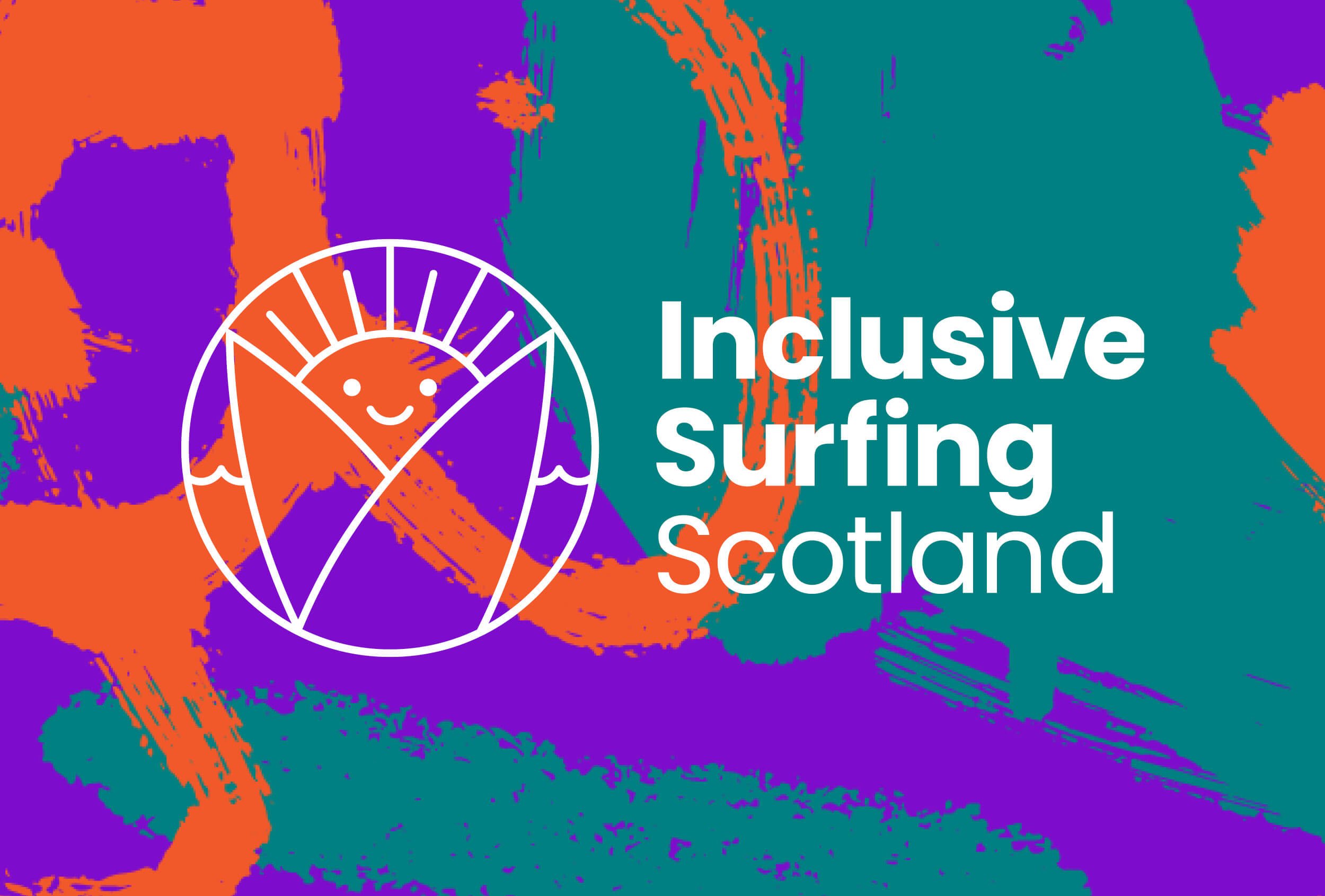
There are lots of surfing brands out there, and can you guess which motif frequently features on their logos? You got it, it’s a camel. Just kidding, it’s a wave. We wanted ISS’s logo to stand out from the pod, so we created a smiling sun design to evoke friendliness and warmth.
We supplemented the logo with distinctive swirl patterns and a vibrant orange, teal and purple colour palette. Plus, we chose simple, legible fonts to make the brand more accessible to people with a visual impairment.
Inclusive Surfing Scotland now has a standout brand look and feel, which can be expanded as the charity evolves.
“Inclusive Surfing Scotland is a charity that offers adaptive surfing sessions to children and adults with a wide range of disabilities. We approached Sophie at Flock at the very early stages of the charity’s development to help bring our mission and values to life in the form of a fun, accessible and memorable brand.”
“Sophie delivered a number of outstanding options that the board of trustees struggled to choose between. Ultimately, the charity selected the sunny roundel that emphasises both the happiness and freedom surfers feel in the water and the welcoming warmth and friendliness of Inclusive Surfing Scotland. The choice of font is simple and clearly legible, something that is vital as some of the surfers we work with have visual impairments. Supplementing these elements is a distinctive pattern that highlights everyone's differences and represents the inclusion model our charity stands for.
With so many brands in the sector sharing similar wave based logos and blue colours, we definitely stand out from the crowd! Our branding and distinctive colour scheme draws frequent positive comments from surfers, other charities and members of the public. Sophie’s design work has become so central to our charity and truly encapsulates our mission to make surfing accessible to everyone. We cannot thank Sophie enough for her time and support.”
Iain Donaldson, Founder and CEO, Inclusive Surfing Scotland